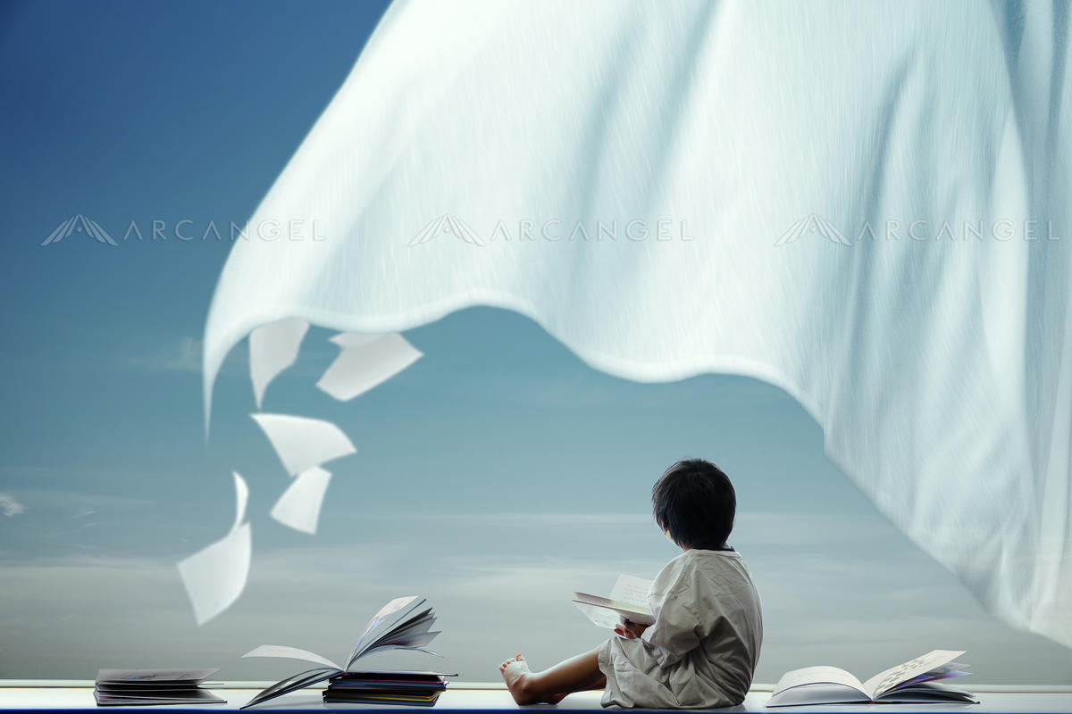
AA11061457
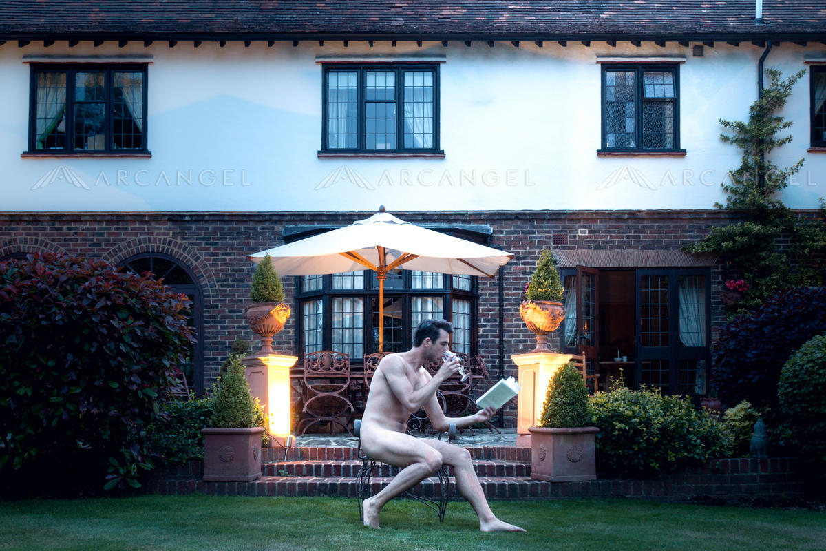
AA1903173
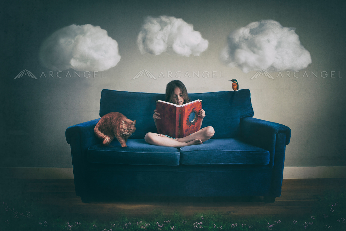
AA1814450
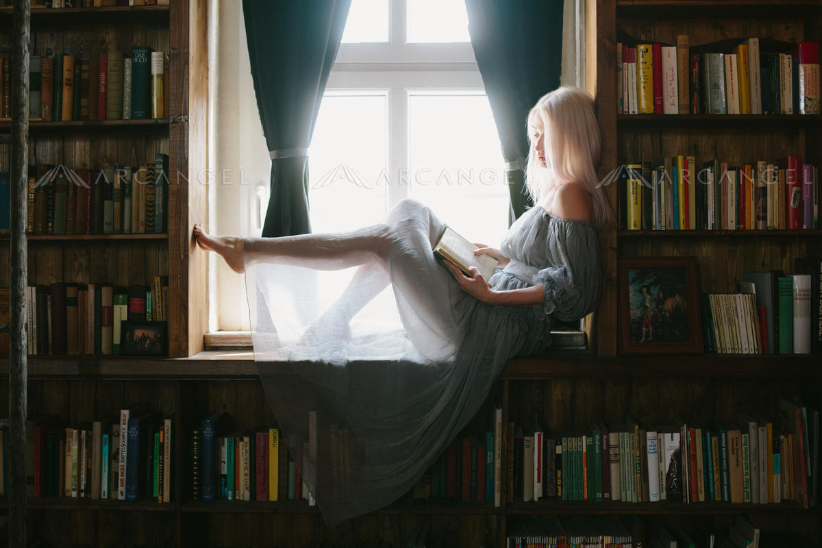
AA11050539
What we look for in book cover photography
-

- AA11061457
-

- AA1903173
-

- AA1814450
-

- AA11050539
As book cover photography specialists, the Arcangel submissions team have a great deal of expertise in regard to what works in book cover design!
Every week, thousands of new image submissions are assessed before being accepted or rejected for the Arcangel collection. We employ our industry experience together with the feedback we’ve received from book cover designers to determine what’s suitable for our library.
There’s no definitive guide to what makes an image work, but keeping in mind the following tips will help give your imagery the best chance of being accepted…
Things we look for…
One strong focal point.
A book cover needs to stand out, so something in the picture must draw the eye. Clear compositions without too many competing elements work well. The image’s core concept needs to be obvious.
Adaptability.
Consider subjects that could be interpreted in different ways or in different genres. A broken teacup could represent a relationship breakdown, for example, but it could also suggest the scene of a crime. Similarly, use obscured faces or rear views of people so that their expression and mood are more ambiguous.
Inventiveness.
You’ll see many elements used again and again on book covers – running female figures in thrillers, for example. Images catering to these will always be in demand, but we want to see imaginative takes on established concepts.
Engaging characters.
Posing for a book cover is very different from posing for a fashion magazine. Characters featured on book covers usually need to be attractive but they also need to be someone a reader can identify with. A sense of personality and authenticity is important in your subject, and it’s possible to be too glamorous!
Things to avoid…
Lots of textures and effects.
There’s a place for using filters and applying other effects in post-production, but removing unwanted effects from an image is much more difficult than adding new ones. For this reason, designers often prefer to start with a ‘clean’ image and apply their own effects.
Technical errors.
We have to be very rigorous in accepting submissions and small errors can let down an otherwise great image. Poor perspective correction or spots caused by dirty lenses are frequent examples and will usually result in us rejecting a photo.
Historical inaccuracies.
We know historical costume photography can be costly and elaborate to set up, so it’s heartbreaking when we see glaring anachronisms in an image – things like coloured nail polish, tattoos, nose piercings, and 21st-century make-up techniques. Unfortunately, these won’t pass muster with publishers.
Good luck in your photoshoots and we look forward to receiving your next submissions!
For more information go to arcangel.com or check out our Book publishing themes online, to get a feel for what clients want https://www.arcangel.com/Browse/Explore-book-publishing-themes
